

Halloween is a bewitching holiday that always brings us a lot of fun with its spooky, mysterious atmosphere! Join me in this tutorial to create a whimsical scene featuring a haunted house on a hill in Adobe Illustrator. We'll use the Pencil Tool, Gradient Tool, Blending Modes, and our boundless imagination. Sharpen your digital pencils and let’s get started!
萬聖節是一個迷人的節日,總是給我們帶來了很多樂趣與它的幽靈,神秘的氣氛!加入我在這個教程中創建一個異想天開的場景具有一個鬧鬼的房子在山上的Adobe Illustrator。我們將使用漸變工具,漸變工具,混合模式,和我們無限的想像力。削尖你的數字鉛筆,讓我們開始吧!
1. Start from Scratch and Form Your Color Palette
1. 從零開始,形成你的顏色圖案
Step 1步驟1
I usually start creating my artwork by making a rough sketch. When the sketch is ready, create a New Document of a comfortable size in Adobe Illustrator and set it to RGB Color Mode.
我通常開始創作我的藝術作品,使一個粗略的草圖。當草圖準備好後,在Adobe Illustrator中創建一個合適大小的新文檔,並將其設置為RGB顏色模式。

File > Place your sketch in the document and click twice on the layer in Layers panel to call out the Layer Options menu. Check the Template box, thus locking the layer and dimming the image.
文件>將草圖放入文檔中, 在圖層中的圖層上單擊兩次 用於調出圖層選項的面板 菜單.選中「模板」框,從而鎖定該層並使圖像變暗。

Step 2步驟2
Go on and form a color palette, which will help us to create a proper mystical mood for our artwork. Start by creating two small, even squares, one above the other, using the Rectangle Tool (M). Fill the upper square with dark-blue color and the lower one with pink color.
繼續並形成一個調色板,這將有助於我們為我們的作品創造一個適當的神秘情緒。首先創建兩個小的,甚至廣場,一個在另一個上面,使用矩形工具(M)。用深藍色填充上面的正方形,用粉紅色填充下面的正方形。
Select both squares and go to Object > Blend > Make or use the Blend Tool (W) to create a group of squares. You can change the Blend Options in Object > Blend > Blend Options and set the Spacing to Specified Distance of 60 px.
選擇這兩個方塊,然後轉到對象%3 E混合%3 E製作或使用混合工具(W)創建一組方塊。您可以更改對象>混合>混合選項中的混合選項,並將間距設置為60 px的指定距離。& nbsp;你好
Create a second Blend Group, using yellow and dark-orange colors, and then Object > Expand both groups.
創建第二個混合組,使用黃色和深橙色,然後對象>展開兩個組。

Step 3步驟3
Select the dark-purple palette that we've just made and click the New Color Group button (a folder icon) in the Swatches panel, creating a group of swatches. Do the same moves with the yellow-orange palette.
選擇我們剛剛製作的深紫色調色板,然後單擊「色板」面板中的「新建顏色組」按鈕(文件夾圖標),創建一組色板。用黃橙色的調色板做同樣的動作。

Step 4步驟4
Let’s make our drawing process more fluid and comfortable. Place our Sketch Layer on top of the Layers panel and set the Blending Mode of the sketch image to Multiply (you will have to Unlock the layer for a while by clicking the lock icon). Use the lower layer for drawing, so that your sketch remains visible on top of all other objects.
讓我們的繪圖過程更加流暢和舒適。將我們的草圖層放在圖層面板的頂部,並將草圖圖像的混合模式設置為相乘(您將不得不通過單擊鎖定圖標來暫時隱藏圖層)。使用較低的圖層進行繪製,以便您的草圖在所有其他對象之上保持可見。

2. Outline the Basic Shapes of Your Sketch With the Pencil Tool
2. 使用輪廓工具勾勒草圖的基本輪廓
Step 1步驟1
Let’s tweak and tune our digital pencil! Click twice on the Pencil Tool (N) icon in the Tools panel and set the Fidelity and Smoothness values to 2 in the pop-up Pencil Tool Options window. Tick the Fill new pencil strokes and the Edit selected paths checkboxes. Leave all other options as default.
讓我們調整和調整我們的數字鉛筆!在「工具」面板中的「平滑工具(N)」圖標上單擊兩次,然後在彈出的「平滑工具選項」窗口中將「保真度」和「平滑度」值設置為2。勾選填充新的鉛筆筆劃和編輯選定的路徑複選框。保留所有其他選項為默認值。
Select the second-darkest color of our palette and freehand the silhouette of the haunted house, following the lines of the sketch.
選擇我們調色板中第二深的顏色,沿著草圖的線條,徒手畫出鬼屋的輪廓。

Step 2步驟2
Create a rectangle for the background, using the Rectangle Tool (M), and Send to Back (Shift-Control-[). Fill the background with the radial gradient, applying the yellow and lilac tones of our palette. Move the center point of the gradient up and to the left, using the Gradient Tool (G) to create the proper environmental light for our future composition.
創建一個矩形的背景,使用矩形工具(M),並發送到後面(Shift-Control-[)。用放射狀漸變填充背景,應用我們調色板中的黃色和淡紫色色調。將漸變的中心點向上和向左移動,使用漸變工具(G)為我們未來的構圖創建適當的環境光。

Step 3步驟3
Proceed by outlining the quirky hill and filling it with linear gradient from dark blue to a lighter purple, creating a strong contrast with the background.
繼續勾勒出古怪的小山,並填充從深藍色到淺紫色的線性梯度,與背景形成強烈的對比。

Step 4步驟4
Draw out another hill behind the first one. Make it slightly lighter to create a feeling that it is far away, thus emphasizing the perspective.
在第一座山後面再畫一座山。使它稍微輕一點,以創造一種感覺,它是遙遠的,從而強調的角度。

Step 5步驟5
Add a few tree silhouettes: a creepy crooked tree with bare branches in the foreground and a group of fir trees on the right-hand side of our haunted house. The scene is starting to look more interesting and eerie.
添加一些樹的輪廓:一棵令人毛骨悚然的彎曲的樹,前面是光禿禿的樹枝,我們鬼屋的右手邊是一群冷杉樹。場景開始看起來更有趣和怪異。

Step 6步驟6
Let’s add the brightest, most eye-catching element of our composition—the whimsy moon! A crescent moon, to be more exact. Trace its silhouette with the Pencil Tool (N), making as many bumps and dimples as you can. Add some fancy details, such as a piece of a moon stone levitating between the tips of the crescent, and some small drop-shapes to create the effect of a dripping surface.
讓我們加入最明亮,最引人注目的元素,我們的組成-異想天開的月亮!更準確地說,是一輪新月。用輪廓工具(N)描繪它的輪廓,儘可能多的凹凸和酒窩。添加一些花哨的細節,比如一塊漂浮在新月形頂端之間的月亮石,以及一些小水滴形狀來創造滴水表面的效果。

Step 7步驟7
Move on and add a few cloud silhouettes, partially covering the moon to make the image more intricate. Use the second brightest color from our blue-purple palette.
繼續,添加一些雲的輪廓,部分覆蓋月亮,使圖像更加複雜。使用第二明亮的顏色從我們的藍紫色調色板。

Continue adding clouds and making the picture more detailed. Put some of the clouds on top and hide the others behind the moon by Sending them to Back (Shift-Control-[).

Step 8步驟8
Now for the fun part! Take the Pencil Tool (N), set the Fill color to None and the Stroke color to the brightest yellow. Scribble around the moon with a circular movement of your hand, creating a rough, sketchy effect.
現在是有趣的部分!使用填充工具(N),將填充顏色設置為無,將筆觸顏色設置為最亮的黃色。用你的手在月亮周圍畫一個圓圈,創造一個粗糙的,粗略的效果。

3. Fill the Basic Elements of Your Artwork With Details
3. 用細節填充藝術品的基本元素
Step 1步驟1
Let’s make the moon more realistic and dimensional. Pencil a shape inside the crescent, following its lower part, but making it a bit smaller. Fill the newly created element with linear gradient from bright yellow (the same as the crescent color) to darker yellow, so that it blends nicely with the main shape.
讓我們把月亮畫得更真實更立體。新月形內的一個形狀,跟隨它的下部,但使它有點小。使用從亮黃色(與新月顏色相同)到暗黃色的線性漸變填充新創建的元素,以便它與主要形狀很好地融合。

Step 2步驟2
Add another shape for the upper part of our crescent and fill it with linear gradient from yellow to black. Switch the Blending Mode to Screen, making the moon slick and shiny.
添加另一個形狀為我們的新月形的上部,並填補它與線性梯度從黃色到黑色。將混合模式切換到屏幕,使月亮光滑閃亮。

Step 3步驟3
Add a small, elliptical shape, forming a dimple. Switch to Multiply Blending Mode and fill the shape with linear gradient from yellow to white, creating a shadow and the impression of deepness.
添加一個小的橢圓形,形成一個酒窩。切換到多重混合模式,用黃色到白色的線性漸變填充形狀,創建陰影和深度的印象。

Step 4步驟4
Duplicate the created dimple and place it on the other side of the crescent, adding more holes. Make the dimple embossed by placing a bright, thin stripe in Screen Blending Mode along the edge of the hole.
複製創建的酒窩,並將其放在新月的另一邊,添加更多的孔。在「屏幕混合模式」下,沿孔邊緣沿著放置一條明亮的細條紋,使凹坑凸起。

Step 5步驟5
Copy the shape that we created earlier in the lower part of our crescent and fill it with a darker tint of yellow. Go to Effect > Stylize > Feather and apply a gentle blurring effect with 30 px Radius value.
複製我們之前在新月形的下部創建的形狀,並填充較深的黃色。轉到效果>風格化>羽毛並應用30 px半徑值的柔和模糊效果。

Finally, our crescent looks like a sugar candy and attracts the viewer's attention with its smooth shapes! Let’s move on and decorate other elements of our artwork in the same shiny style.
最後,我們的新月看起來像一個糖果,並吸引觀眾的注意力與其光滑的形狀!讓我們繼續前進,並裝飾我們的藝術作品中的其他元素在相同的光澤風格。

Step 6步驟6
First of all, we need to add some details to each cloud. This process might seem a bit tedious, but if you're keen on freehand drawing, you will enjoy watching your picture get fleshed out. Draw the swirls and twirls on each bulge of the cloud—lighter for the highlights and darker for the shadows.
首先,我們需要為每個雲添加一些細節。這個過程可能看起來有點乏味,但如果你熱衷於徒手畫,你會喜歡看你的圖片得到充實。在雲的每一個凸起上畫出漩渦和旋轉--亮一點的為高光,暗一點的為陰影。

Step 7步驟7
Fill the darker shape with linear gradient, one end of which has the same color as the cloud, while the other end is slightly darker. As for the highlight shapes, use the Screen Blending Mode and a linear gradient with bright-orange color on one end and black on the other.
用線性漸變填充較暗的形狀,其一端與雲的顏色相同,而另一端略暗。至於高亮形狀,使用屏幕混合模式和一個線性漸變,一端是亮橙色,另一端是黑色。
Rotate the gradients using the Gradient Tool (G) so that they blend seamlessly with the basic cloud shape.
使用漸變工具(G)旋轉漸變,使它們與基本的雲形狀無縫融合。

Step 8步驟8
Add smaller reflections to intensify the moonlight, creating a glossy effect on the bulgy parts of the cloud.
添加較小的反射以增強月光,在雲的凸出部分上創建光澤效果。

Step 9步驟9
Work more on the other clouds, paying attention to their colors: make those lower clouds darker than the upper ones, as if they are hidden in the lowlands and don’t reflect as much light from the moon.
在其他雲層上多下功夫,注意它們的顏色:讓那些下層的雲層比上層的雲層更暗,就好像它們隱藏在低地,不會反射太多的月光。

Continue adding luminance to the upper part of our composition.
繼續添加亮度到我們的組成的上部。

Draw those tiny swirls and paw-like shapes with the Pencil Tool (N) with a flowing movement of your hand.
使用鉛筆工具(N),用手流暢地繪製那些微小的漩渦和爪子狀形狀。

Step 10步驟10
The colors of the overtones should match the environment lighting. In fact, the lower clouds should have a cool, bluish highlight, while the clouds that are closer to the moon keep their warm, yellow-orange tones.
泛音的顏色應與環境照明相匹配。事實上,較低的雲層應該有一個涼爽的藍色亮點,而靠近月球的雲層則保持溫暖的黃橙色色調。

Step 11步驟11
Let’s take a look at the overall composition to ensure that we haven’t missed anything.
讓我們來看看整體組成,以確保我們沒有錯過任何東西。

Use the Shape Builder Tool (Shift-M) to fix the parts of the clouds that are overlapping with the hill, or simply press Control-[ to rearrange the objects, moving the cloud under the hill.
使用形狀生成器工具(Shift-M)來修復與山丘重疊的雲部分,或者只需按Control-[重新排列對象,將雲移動到山丘下方。

Step 12步驟12
Edit the color of the trees in the same way, making their lower edge blend with the ground.
以相同的方式編輯樹的顏色,使其下邊緣與地面混合。

Step 13步驟13
Add a path leading to the haunted house. Make its lower part much wider to emphasize the perspective and to show that the house is located far away from the viewer.
添加一條通往鬼屋的小路。讓它的下部更寬,以強調透視,並表明房子位於遠離觀眾。

Step 14步驟14
Use the Rectangle Tool (M) to create thin stripes and combine them into a group of planks, forming a supporting structure for the house.
使用矩形工具(M)創建細條紋和聯合收割機他們成一組木板,形成一個支持結構的房子。

Step 15步驟15
Let's create an illusion of a bright light coming through the windows of the house, adding a touch of mystery. Our sketch already contains some windows, so we just need to outline them. For this step I use the Pen Tool (P) to create a half-ellipse shape, but you can use the Pencil Tool (N) if you prefer, or just erase a part of an ellipse to create the same window aperture as you see on the screenshot below.
讓我們創造一個明亮的光線通過房子的窗戶進來的錯覺,增加一點神秘感。我們的草圖已經包含了一些窗口,所以我們只需要畫出它們的輪廓。對於這一步,我使用鋼筆工具(P)來創建一個半橢圓形狀,但如果你喜歡,你可以使用橡皮擦工具(N),或者只是擦除橢圓的一部分來創建相同的窗口孔徑,正如你在下面的截圖中看到的。

Step 16步驟16
Fill the created shape with dark-blue linear gradient and add a smaller copy of the same shape above, filling it with linear gradient from pale-orange to dark-orange.
用深藍色線性漸變填充創建的形狀,並添加上面相同形狀的較小複本,用從淡橙色到深橙色的線性漸變填充它。

Step 17步驟17
Duplicate the dark shape and select its upper anchor point with the Direct Selection Tool (A). Drag the anchor point down to put the shape flat on the ground.
複製深色的形狀,用直接選擇工具(A)選擇它上面的錨點。向下拖動錨點以將形狀平放在地面上。

Step 18步驟18
Adjust the gradients, creating a sense of light pouring on the ground out of the open window (or it is more likely to be a front door).
調整梯度,創造一種光線從打開的窗戶傾瀉到地面上的感覺(或者更可能是前門)。

Use the Reflect Tool (O) to mirror the created element over the Vertical Axis. Make several copies of the reflected window and place them on the opposite wall, decreasing their size.
使用反射工具(O)在垂直軸上鏡像創建的元素。使 複製幾個反射窗口,並將它們放在對面的牆上,減小它們的大小。

Step 19步驟19
Create multiple copies of the windows and put them in the appropriate places.
創建窗口的多個複本並將它們放在適當的位置。

Step 20步驟20
Move on and form the left side wall by adding a curved rectangle shape. Fill the shape with a gentle lilac-white linear gradient and switch it to Multiply Blending Mode, thus creating a shadow and making the house dimensional.
繼續前進,通過添加一個彎曲的矩形形狀來形成左側牆。用柔和的淡紫色-白色線性漸變填充形狀,並將其切換到「相乘混合模式」,從而創建陰影並使房屋具有立體感。

Render the roof of the house in the same way as the wall.
把房子的屋頂渲染在同一個 就像牆一樣。

Add a sharp, zigzagged shape above the roof. Select both objects and use the Minus Front function in Pathfinder to form some cracks.
在屋頂上方添加一個尖銳的鋸齒形形狀。選擇這兩個對象,並使用路徑查找器中的減去前面的功能,形成一些裂縫。

Work over the other parts of the house in the same way, rendering shadows and creating a realistic look.
以同樣的方式處理房子的其他部分,渲染陰影並創建逼真的外觀。

4. Add a Touch of Magic
4. 添加一點魔法
Step 1步驟1
To create a mysterious, Halloween atmosphere in our image, we're going to add some minor details. Individually, they'll barely be noticeable at first glance, but they'll all come together to create the effect we're looking for. Let’s add some of these tiny elements here and there to make our artwork more intricate.
為了在我們的圖像中創造一種神秘的萬聖節氣氛,我們將添加一些小細節。單獨來看,它們第一眼看起來幾乎不明顯,但它們都會聚集在一起,創造出我們想要的效果。讓我們在這裡和那裡添加一些這些小元素,使我們的作品更加複雜。
First of all, add more light to the windows, by adding a conelike shape and filling it with a bright gradient in Screen Blending Mode.
首先,在屏幕混合模式下,通過添加一個錐形形狀並填充明亮的漸變,為窗戶添加更多的光線。

Step 2步驟2
Now let’s make a small but very important element, which produces a subtle, magical effect—the sparkle! Sparkles always create a feeling of something mysterious and supernatural.
現在讓我們來做一個小而重要的元素,它能產生微妙而神奇的效果--閃光!火花總是創造一種神秘和超自然的感覺。
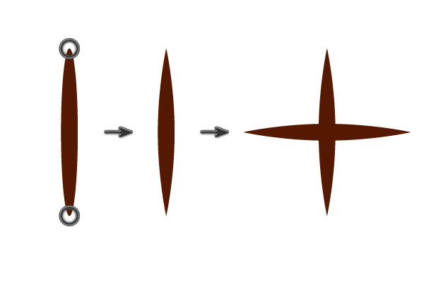
Making a sparkle is quite simple: create two even circles and fill them with radial gradients as shown on the screenshot below. Use yellow-black gradient with a small center for one circle and orange-black gradient with a larger center for the other.
製作一個閃光點非常簡單:創建兩個均勻的圓,並使用徑向梯度填充它們,如下圖所示。一個圓使用小中心的黃黑漸變,另一個圓使用大中心的橙黑漸變。
Put one circle above the other and switch them to Screen Blending Mode. The black color will become transparent, creating a warm glow. Magic indeed!
把一個圓圈放在另一個上面,然後把它們切換到屏幕混合模式。黑色將變得透明,產生溫暖的光芒。果然是魔法!

Step 3步驟3
Spread the sparkles in front of a doorway as if they are flying out of the house.
在門口前散布火花,就像它們飛出房子一樣。

Decorate several more windows using the same technique. However, avoid adding sparkles to all of the windows so as not to overload the picture with small details, because they create “noise” which can be very distracting for the viewers.
裝飾幾個窗口使用相同的 法然而,避免添加火花到所有的窗口,以免 用小細節使圖片過載,因為它們會產生「噪音」, 會讓觀眾分心

Step 4步驟4
Our picture is almost complete! Let’s add some interesting elements, which will attract more attention and enliven the composition. We need some characters suitable for a Halloween theme. As you remember, we already have a naked tree in the foreground, so let’s add a bat hanging upside-down on one of the branches.
我們的照片幾乎是完整的!讓我們添加一些有趣的元素,這將吸引更多的注意力,使作文生動起來。我們需要一些適合萬聖節主題的人物。正如你所記得的,我們已經有一個裸體的樹在前景,所以讓我們添加一個蝙蝠倒掛在一個分支。
Draw a whimsy curved shape using the Pencil Tool (N) to depict the left part of a bat's silhouette. Reflect the shape over the Vertical Axis and combine the halves, forming a single silhouette. Add a darker shape above, forming a wing, wrapped around our bat. Add two red eyes, making them sharp-pointed to create an evil look.
使用繪圖工具(N)繪製一個古怪的曲線形狀來描繪蝙蝠輪廓的左半部分。將形狀反射到垂直軸上,然後將兩半聯合收割機合併,形成單個輪廓。在上面添加一個較暗的形狀,形成一個翅膀,包裹在我們的蝙蝠周圍。添加兩個紅色的眼睛,使他們尖銳,創造一個邪惡的外觀。

Step 5步驟5
Let’s fit our bat on the tree. Make it darker, if needed, to emphasize the contrast between the character and the background.
讓我們把球棒掛在樹上。如果需要的話,讓它更暗,以強調人物和背景之間的對比。

Use one of the sparkles that we created a few steps ago and put it over the bat’s eye, making it glow bright red.
使用我們創造的一些火花之一, 幾步前,把它放在蝙蝠的眼睛上,使它發出明亮的紅色。

Step 6步驟6
Draw out a scribbled shape, imitating the tree bark. Use the same filling gradient as we have on the walls of the house, switching to Multiply Blending Mode.
畫出一個潦草的形狀,模仿樹皮。使用相同的填充梯度,因為我們在牆上的房子,切換到乘法混合模式。

Step 7步驟7
We have the last move left! Let’s add brightness to our image, making it more vivid and saturated. Make a big rectangle, covering the whole Artboard, and fill it with radial gradient, consisting of orange, pink and dark-purple colors, as shown on the screenshot.
我們還有最後一招!讓我們為圖像添加亮度,使其更加生動和飽和。做一個大的矩形,覆蓋整個畫板,用徑向漸變填充,包括橙子,粉色和深紫色,如屏幕截圖所示。
Switch the Blending Mode to Overlay and decrease the Opacity to 30%. This simple method gives our image a bright, candy-like look! Now the colors look much better.
將混合模式切換為疊加,並將不透明度降低到30%。這個簡單的方法給我們的圖像一個明亮的,糖果般的外觀!現在顏色看起來好多了。

Step 8步驟8
Create another rectangle the same size as our Artboard and put it above all other elements by clicking Shift-Control-]. Select everything (Control-A) and right‑click to call a pop-up menu. Make Clipping Mask to hide the pieces outside the Artboard.
創建另一個與我們的畫板大小相同的矩形,並通過單擊Shift-Control-]將其放置在所有其他元素之上。選擇所有內容(Control-A)並右鍵單擊以調用彈出菜單。製作剪貼蒙版以隱藏畫板外的碎片。

Yay! Our Creepy House on the Hill is Finished!
好耶!我們山上的Creamy House是 完了!
Congratulations! You’ve just finished building a mysterious Halloween scene and should be proud of yourself. I hope you’ve enjoyed following these guidelines and found some useful tips and tricks for your future work. Happy Halloween, folks!
恭喜你!你剛剛完成了一個神秘的萬聖節場景,應該為自己感到自豪。我希望你喜歡遵循這些指導方針,並為你未來的工作找到一些有用的提示和技巧。萬聖節快樂,夥計們!

 By通過
By通過